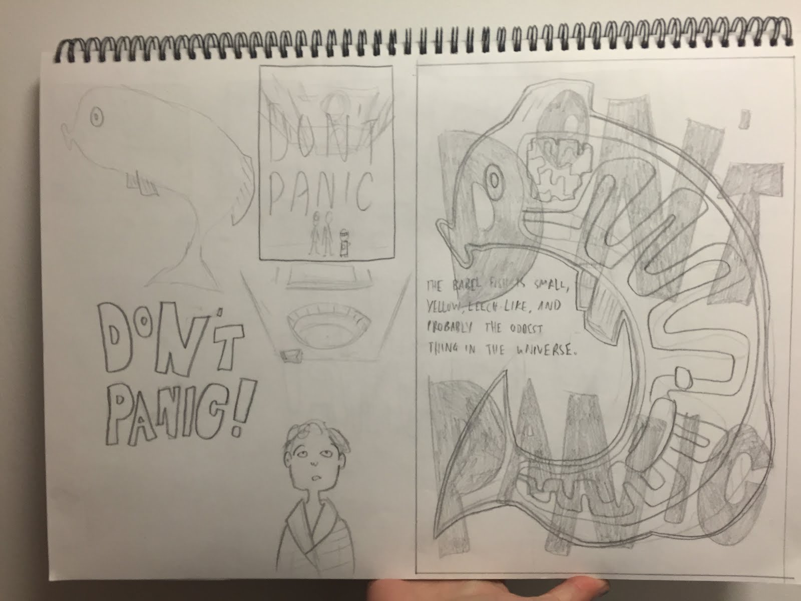
I drew the babel fish as the first layer, and the words Don't Panic would be the second layer.
Instead of this design though, I did some more sketching and came up with a design that would work better for the visual language module. I focused a fair bit on depth and line of sight and I think this comes though in the design. These are the two positives that I screenprinted with and the final version.


I think that the colours interact with each other quite well, and I'm relatively pleased with the texture I tried to incorporate into the blue layer. This task really helped me understand photoshop and screenprinting a lot better, since I'd never used bitmap before and these prints have registered much better than any screenprints I've done before. I think maybe if I had chosen to create the positives digitally the result might've been nicer, because it could've resulted in a cleaner screenprint with more accurate registration and the textures would have been more uniform, but I'm still really happy with the result.
No comments:
Post a Comment