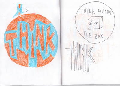
These ideas are quite uninspiring but I really like the more geometric, blocky style of the writing on the second page so I chose to explore this. I think simpler, more punchy designs like that are more effective for stickers, especially one trying to encourage the viewer to do something because it gets the idea across quite quickly.
I explore the phrase "think outside the box" a bit in my ideas, because I liked that this related to art as well and pushing yourself to create new and exciting work and think about things in different ways. I wanted to focus on this because thinking up new ideas and experimenting with things I haven't done before is something that I personally struggle with a lot in my practise.
While I don't think the boxy brain idea is very good, I really like the colour scheme and trying to simplify down an image.
Moving on from those ideas, I wanted the point behind these designs to be "it will be ok" or something encouraging along those lines. I didn't want to rely on words to get this point across in my stickers so I chose the hand symbol for "ok" and personified it by giving it a face. I am really keen on the colour scheme and basic design for this and I'm quite set on it being my finished sticker design. From this point it is just a case of refining the shape further and any extra experimentation I want to do. I'm not sure which way to have the hand facing because the way I've done most of the designs looks better in my opinion, but if I want the hand to make the "OK" shape then the hand has to be the other way around.


No comments:
Post a Comment