Monday, February 27, 2017

Acts of Kindness: Test Stickers


These are the first two quick test sticker designs I did on Illustrator. I don't think they're as effective as they are in my sketchbook, and I think this could possibly because everything is very exact on Illustrator. Also, for the illustrator versions I tried to balance the shape out on the sticker more than in my sketchbook but maybe that doesn't suit the design and I should keep things unbalanced.

I'm also not too keen on the really flat colours on these designs so maybe I should use tone in the stickers to try and make it a bit more visually interesting.

Acts of Kindness: Initial Ideas

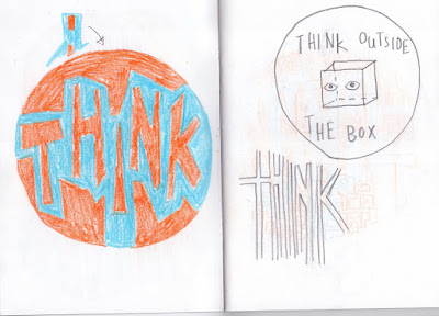
I found coming up with initial ideas for this project to be quite challenging because I didn't want my ideas to be cliché, and I feel like that could be a very easy trap to fall into with this project. After writing out a list of all of the acts of kindness I could think of, I began to develop some sticker designs based around words like "think" and "smile". I thought that if my starting point was just one word it would give me a lot of space to develop and explore the design.


These ideas are quite uninspiring but I really like the more geometric, blocky style of the writing on the second page so I chose to explore this. I think simpler, more punchy designs like that are more effective for stickers, especially one trying to encourage the viewer to do something because it gets the idea across quite quickly.


I explore the phrase "think outside the box" a bit in my ideas, because I liked that this related to art as well and pushing yourself to create new and exciting work and think about things in different ways. I wanted to focus on this because thinking up new ideas and experimenting with things I haven't done before is something that I personally struggle with a lot in my practise. 

While I don't think the boxy brain idea is very good, I really like the colour scheme and trying to simplify down an image.


Moving on from those ideas, I wanted the point behind these designs to be "it will be ok" or something encouraging along those lines. I didn't want to rely on words to get this point across in my stickers so I chose the hand symbol for "ok" and personified it by giving it a face. I am really keen on the colour scheme and basic design for this and I'm quite set on it being my finished sticker design. From this point it is just a case of refining the shape further and any extra experimentation I want to do. I'm not sure which way to have the hand facing because the way I've done most of the designs looks better in my opinion, but if I want the hand to make the "OK" shape then the hand has to be the other way around. 


Thursday, February 23, 2017

Frame and Arrangement


These are the roughs I did for the task of experimenting with frame and arrangement. I ended up using the rough on the bottom left, which I thought was the most visually interesting.


I think that in terms of depth and line of sight this piece works quite well because the elephants trunk leads the viewers eyes down to the rest of the elephant and the figure and the leaves frame the picture, but after looking at the work other people produced for this task I think I could have been more experimental in what I did. For example, a few people made pieces that were really long and narrow and worked within that frame to produce an illustration that turned out very effective. Other people used different viewpoints that gave really interesting results, for example one illustration was done from a point of view below the elephants feet and I think that was very effective.

Wednesday, February 22, 2017

Colour and Value

I decided I wanted my fanart poster to be based around Hitchhikers Guide to the Galaxy as I'm a huge fan of both the books and tv series. I was really happy with my first few designs and I think they would have made good screenprints but they're quite graphic-y, and for visual language I think the idea was to explore all the things we've learnt so far about composition, depth, line of sight etc. so it wasn't the most suitable design for the task.

I drew the babel fish as the first layer, and the words Don't Panic would be the second layer.


Instead of this design though, I did some more sketching and came up with a design that would work better for the visual language module. I focused a fair bit on depth and line of sight and I think this comes though in the design. These are the two positives that I screenprinted with and the final version.


I think that the colours interact with each other quite well, and I'm relatively pleased with the texture I tried to incorporate into the blue layer. This task really helped me understand photoshop and screenprinting a lot better, since I'd never used bitmap before and these prints have registered much better than any screenprints I've done before. I think maybe if I had chosen to create the positives digitally the result might've been nicer, because it could've resulted in a cleaner screenprint with more accurate registration and the textures would have been more uniform, but I'm still really happy with the result.

Depth and line of sight


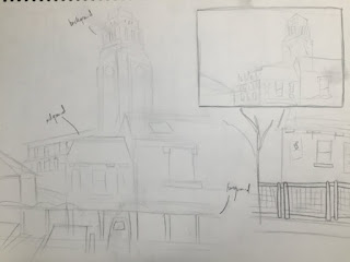
These are the initial sketches I made for the depth and line task, trying to differentiate the background, foreground and midground.


Instead of sticking all the individual layers down, i chose to make a 3D diorama style illustration because this way I felt I could get more depth into the drawing. I'm quite happy with the result, however I was quite focused on depth and forgot a bit about the line of sight which I think could be improved much more in this drawing. I think perhaps if I had done more initial drawings out of other windows and drawn more elements and then combined them into one image instead of just drawing one viewpoint, the illustration would have been more visually interesting.

3D and lens

For this task, we were asked to produce a 3D illustration that shows a superpower or mutation that we wish we could have. For mine, I chose to be able to breathe and live underwater.

Some of the elements of this were quite straight forward, for example the watery background. For that I just painted some big pieces of paper an uneven blue. I really wanted to make it look like there were some fish swimming about so I spent a long time looking through shops for fake toy fish but I couldn't find any so I had to resort to printing and cutting out images of fish and hanging them up with string.

I really wanted to play with lens in this illustration and to do this I thought I could fill a clear contained up with soapy water and use a gopro to take a photo through this to give a watery, fluid feel to the photo, however this didn't work out very successfully.


After I had set everything up, I tried to take some photos but the lighting wasn't right and all the photos I took turned out quite yellow, so I also needed to adjust the lights.


Once this was sorted, I tried out a variety of angles and poses.


This was the final image that I was most happy with. Overall, I'm fairly happy with this image. I think the colours work quite well together, and the idea behind the illustration is quite clear. However, I think maybe I could have experimented further with composition, perhaps making it less obvious what the idea behind the image was but making a more visually interesting piece. 3D and lens is definitely a medium I would like to explore further though because it has a very different feel to it than other illustrations.

Digital Gif


Out of all my gifs, I'm the least happy with this one. I'm not very confident with drawing digitally which made making this quite challenging. Because of the zooming in sense to this gif I found it hard to make it seem quite smooth which is why the gif seems to look a bit shaky when zooming into the eye. I might try and redo this gif because I think I could do a much better job if I improve my digital art skills. Also, from looking at everyone elses gifs during the presentation the most effective digital gifs in my opinion were the ones where not too much stuff moved, just a few key elements. I think that's why mine isn't very effective, because everything in every frame is changing so its hard on the eyes to keep watching.

Hand Drawn Gif


This was my initial tester gif for the hand drawn gif. I scanned all the frames in without colour first to test out whether the movements would work and I was quite happy with it. I think I probably could have taken more care with registering each frame to the last because as the gif progresses a lot of the shapes that I had intended to stay the same throughout did change quite a bit. Despite this, I was happy with it overall so I went back and added gouache paint to all the frames and rescanned and animated it.

I was relatively happy with the final gif, I think the movement is okay and the colour works quite well and doesn't change too much throughout. If I were to do this gif again though, I think I would choose to animate fewer parts and maybe choose a more distinctive but simple movement to focus on. I think I would probably also use different media to make the colours stronger and more consistent.


3D gif


I decided to start with the 3D gif because this one was the most clear in my head with the movements and how I wanted it to look. I made the different characters out of fimo, and then put them in the oven to solidify. I'm quite happy with how the characters turned out, but I think maybe I should have made them bigger so I could add more detail to them. However, it is only a small file size and a very short gif so I think keeping it simple worked quite well.

This works well as a tester gif because it helped me figure out the movements I wanted and where I needed it to loop. The top and bottom section of the totem pole loop okay but the middle one didn't really work as well so I knew this was something I had to work on for the final gif. I also wasn't happy with the line where the two pieces of yellow paper lined up so this was also something I changed for the final gif.


I'm happier with the final gif because I think it loops better, and there is also less variation in the lighting of this gif as well which I think is important because it really affects the overall feel of a gif if the lighting changes from frame to frame. One thing I'm not as keen on in this gif is that while I was making it, I didn't realise that I was moving the leaves on the floor when I was moving the snake for each frame so when the gif loops you can see that the leaves go to a different place. This is quite frustrating but other than that I'm generally quite happy with the gif, and this is something I can remember for next time.

Contextual Research Task: gifs

playa

This is a gif by Ori Toor. All of his looping gifs follow a similar aesthetic - low-fi, quite dark bubbly creatures which have looping smooth motions. As far as I can tell, these are purely made digitally on screen. Ori Toor said in an interview with itsnicethat that he doesn't plan out his gifs, he just sits down and starts drawing a frame and then continues adding shapes and colours until a character begins to take form, and then he develops the movements.

I think this is quite an interesting approach because it's challenging to think about the way a shape or character would move when drawing it frame by frame, and considering how smooth and characterful the movements are, it surprises me that he doesn't plan out these gifs.
In the same interview, he says that the gifs generally portray his struggle with depression and trying to cope with it and I think this comes across. Most of his gifs are quite dark and use a minimal colour scheme, and I think the scratchy texture that he applies to all of the characters also contributes to that atmosphere.

I really like this gif (and his others which follow a very similar style) because of the simplicity of the character and the movements, while still getting across strong feelings in his work. I also like the variety of facial expressions he gives his characters and I think the way that these don't change at all but the rest of the gif moves gives an interesting contrast which adds to his work.

Wednesday, February 8, 2017

Initial character ideas

The song I chose out of the three I was given was Fuse by Hudson Mowhawke. It had a very electronic bubbly feel to it, and also some tribal elements. My initial sketches were just wiggly blobby creatures because thats what it sounded like to me.


I'm pretty happy with the amoeba style character as I feel it reflects the song quite well. I also wanted to incorporate instruments because I think this is a key element of the song. I experimented a bit with making the instruments look futuristic and weird because thats how they sound in the song but I also don't want to overcomplicate my character as I need to consider how it will be animated later on.

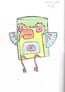
The song has quite a jungly, exploring feel to it so I wanted to try out some character designs based around animals and totem poles.


So far, these were my favourite ideas. I'm not keen on the colours I've chosen but maybe a change of media and further experimentation will help with that.


These are some other ideas I came up with for characters but I felt like maybe they were a bit lazy and too simple. Considering I need to make three gifs with the same character, I think I would be able to do more with the totem pole character than these ones.


These are some further developments with the totem pole idea. I'm relatively happy with where it's going, but I think I need to revisit the idea of multiple totem poles and instruments, and definitely experiment with media to work out the colour scheme I want to use.