Wednesday, November 30, 2016

Photoshop Task


These are my outcomes from the photoshop task. I had a lot of fun creating these, and I think the main features I discovered through this experimentation were the distortion tools, and the layer effects. I hadn't used the layer effects before and I didn't realise the variety of outcomes they could produce. I particularly liked adding multiple solid colour layers and then changing the effects and seeing how all the different layers interacted with each other as a result.

Besides from this, I used the eraser tool to rub out layers of solid colour with different textures to add more detail to these illustrations, this can be seen in the 3rd and 4th drawing. I like the scratchy effect this produces and I think it's going to be something I use more often in my digital illustrations.

Sunday, November 27, 2016

Visual Narratives

On Friday, we had our screenprint induction and made our prints. I had already had my screenprint induction last year on foundation so I knew how to screenprint, but I had never gotten around to experimenting with prints which I did on Friday.

We decided on the colour blue for the bottom layer to represent the rain, but in retrospect we should have chosen a lighter colour for that layer because the sound map didn't show up too well over the top.


This was more or less how the screenprint was meant to work out, and I wasn't too happy with the result. I think it would've looked better if we maybe swapped the colours around, and maybe added more to the top layer. Just having the sound map on the top layer didn't really help add a lot to the print, i think maybe we should've incorporated some of the leaves or puddle shapes to the top layer as well, or possibly some more block colours.


However, when we experimented with layering and mixing colours on the screens I was much happier with the end results. Overlaying the footprint layer in particular was quite effective, because it looks as if someone has walked over the paper. I think if I was to redo this screenprint, I would add more to the sound map layer and then use different colours for the screenprint itself - maybe a green and blue or something that would stand out more.


Visual Narratives

Despite having a frustrating first day of this project, when I discussed ideas for the screenprint with my group we came up with a lot of ideas that I was much happier about.

Since it was so rainy on Monday, we decided we wanted the rain to be a key part of the screenprint. To show this, I went outside and stepped in some mud and then stepped on some paper to make a mark of the bottom of my shoe.


I was happy with the result of this because we ended up with an unexpected texture that we wouldn't have been able to create otherwise. We were originally going to try and photocopy this texture onto the acetate but decided to make it simpler by tracing the marks with the chinograph pencil instead. The result was the same shape but with a different texture.

The main idea behind our screenprint was to make the first layer represent the ground that we were walking on, and then the second layer was going to be a sound map of everything we heard while we were walking around Leeds. For the rest of the footprint layer, we incorporated a receipt, some leaves and some marks to indicate puddles.


For the next layer, we used ink and chinograph pencil to create some marks to represent the sounds we heard. We decided to position these sounds mostly over the footprints to show that the sounds we heard where we walked.


Visual Narratives

On the first day of this project, we had to walk around Leeds and map it in various different ways. For example, drawing the sounds we heard, illustrating things we saw, writing down where we went. 

I found this task really frustrating. We were given a list of ideas of what to map etc but I found that this confused me further and I couldn't settle on any ideas, so I didn't end up with a lot of work.
 

These are some examples of sound maps I made and this turned out to be the most successful idea I ended up with. I enjoyed the spontaneity of this, because I didn't have time to think through what it might look like - I just drew marks as soon as I heard noises. The results are quite interesting because I got a similar drawing for car alarm as someone else in my group, even though we didn't look at each others drawings when we were doing them.


These are some drawings from inside the corn exchange. They didn't end up being particularly useful because I didn't spend enough time on them. I also still wasn't sure how I was meant to be documenting things by this point so they're not as good as I would have liked.

Sunday, November 20, 2016

Shape and Texture

This session was based around shape, which I initially found very difficult to work with. Up until now, almost all of my drawings have been based around line and I hadn't really considered how to use shape to build up images.

 The first task was to use shapes to make pictures of our favourite fruit.


I wasn't happy with the results of this task. I tried to take a simple approach to it which makes it quite obvious that its a lime but other than that I don't think they've turned out that well. I didn't think about layering the shapes over each other at all, which perhaps could have added more depth. I also didn't think about how the shape works with the negative space on the page as well, which is an important part of composing an image. I also could have focused on different parts of the lime each time which is something I'd experiment with next time I use shape.

I found the second task much easier. We had to make a self portrait using shapes, but we were also told to incorporate texture into it as well.
 

I experimented a lot with layering to build up the texture of this piece. For example, on the face I used dark pink card but used tracing paper that I had painted on the lighten it and add some texture. I'm pleased with the way I've used these two materials to create a sense of depth and light on the nose. This task really made me think about what media and techniques would create the texture I wanted - this is why I used a dry brush with ink for the hair, but more freeing ink splotches on the clothes. 

If I had more time I think it would've been fun to try and build up the shape of the fabric of the clothes, maybe by cutting out different shapes and using darker colours to create depth.

Line - Tone, Mark and Pattern

For this session we focused on how we can use marks to create a certain texture or atmosphere to a drawing. For the first task, we were given 3 sets of two opposite words and we had to draw marks to represent them.


This one is 'swarm - still'


'Bonkers - meh'


'Rest - motion'

This task was quite interesting because mark making wasn't something I had really thought about much before. The only times I have considered mark making are for textures, not to convey an emotion or atmosphere so I think I learned a lot from this task. I also realised how important media is in conveying an atmosphere in a drawing. For example, in the second drawing I used ink for the marks, and this emphasises the 'bonkers' element because it can't be controlled as easily as other media.

For the second task, we had to draw a building and incorporate as many patterns and marks as we could.


I chose to make mine a yurt because this gave me lots of different textures to work with. I just did a basic outline with ink and then worked back in with the lighter ink. I really enjoyed this task because I realised how much variety I could get by making different marks with different tools. For example, I really like using the wrong end of a paint brush and dipping it in ink because the resulting mark is quite scratchy and inconsistent. Using drier or wetter paintbrushes also resulted in different effects which worked for different materials of the yurt.

Sunday, November 13, 2016

Evaluation

I initially found this module quite challenging, probably because of how restrictive the briefs were in terms of structure and the sizing and colours we could use. Towards the end of the module though, I began to get to grips with this and how this is a more standard, commercial way to work and I think this can be seen in the progression of the briefs.

I learnt a lot about using different media during this project. Before this course I had never really used ink before, but after the ‘How to’ project I discovered that ink can have some very interesting results when it comes to line quality, which is also something I hadn’t really considered previously. I used my blog throughout this module but I found it quite difficult to keep up with, so I know I have to work on keeping up with it because I did find it useful to reflect on my work and various ideas.

I’m relatively happy with all my final outcomes, particularly the ‘How to’ poster. I found the idea generation quite difficult to begin with since my poster was ‘How to Wrap a Present’. However, once I introduced the ninja character it brought a solid theme and some humour to the poster which helped a lot I think.

I am also happy with my development for the ‘Judge a Book by it’s Cover’ brief. I think I experimented a lot and used a lot of problem solving to try and figure out the best composition and colour for the cover and I was happy with the result because I had tried out so many different things and found solutions for the problems I encountered.

I struggled a lot with idea generation for the Illumination brief. I think this was because the article I was given was about loneliness and social isolation which are quite abstract subjects to try and illustrate. I eventually came up with a concept but it took me a long time to generate ideas for this project. As a result of this, I didn’t get as much time to work on the finished illustrations and sort out any problems as I would have liked. Ideally, I wanted to spend a bit more time on the roughs and I think if I had then I would have realised I needed more depth in the finished illustrations, which is some feedback I received when we had our crit.

I think the main thing I need to work on for future modules is organisation. If I blog regularly alongside my work I think it’ll help massively because then I will be writing my reflections down instead of just having them in my head which will make problem solving much easier. I think in future modules I need to work on my ability to generate ideas and think outside the box, which is something I’ve learnt during this project – particularly the Illumination brief, where I realised I could be a lot less literal with my ideas.

Saturday, November 12, 2016

Judge a Book by it's Cover

After I had established the elements that I definitely wanted to include, I started to experiment with them a bit more.

Scanning one of my roughs in but moving it about to distort it gave quite interesting effects that I was considering incorporating at one point, but I decided against it because I thought that this combined with the automatic drawings might make the book cover seem a bit too busy, and I wanted to keep it fairly simple.


This was a very rough idea of how I wanted the book cover to look. I definitely like how much the blue drawings stand out from the background, but I wasn't sure if it worked with the colour of the brain so I decided to repaint the brain in blue to keep the colour scheme very minimal.


I was much happier with this result because it contrasts much more and also fits in with the colour of the automatic drawings. Also, instead of distorting the painting on the scanner, I moved some of the parts of the brain about which I think works better. It is meant to represent consciousness within the brain and I think it communicates this better than the previous process of distorting.

These are all the elements I used for the final book cover. I decided against handwritten type on the finished book cover because it didn't give a very refined feel to the book which is what I was aiming for.


This is the final book cover. I went for digital type instead because it looks more professional and fits in more with the scientific style of the book. I'm really pleased with the way the brain and the automatic drawings interact to represent both the physical and psychological elements of consciousness. I wanted the end book cover to have more of a vintage feel to it (similar to polish or czech film posters) which I haven't been able to achieve but I don't think this matter too much as a more modern looking book cover perhaps works a bit better with the subject matter. 

I originally was going to fill in all of the blank space with automatic drawings but I think having some negative space is more effective, as it almost gives the feeling that the drawings are slowly spreading out into that space as they're being generated.

Judge a Book by it's Cover

For this project, I chose the book Reframing Consciousness from the library. The book mainly focused on consciousness and how it interacts with art and reality. There was a lot of scientific terminology and the book covered a wide range of subjects throughout which gave me a lot of starting points.

I began my initial ideas by focusing on the framing element of the title by using boxes. This also links in with a lot of the imagery from inside the book, and the use of boxes and grids to represent space (and maybe time) gives off a sci-fi atmosphere.

I realised however that this isn't the most interesting idea to try and develop, and it is also an element of the existing cover.

Instead I decided to focused on the consciousness part of the title and this gave me a lot more ideas to work with.


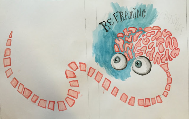
These were my next ideas, and I preferred these much more. the brain and eyes clearly give off the impression that this book has something to do with the brain and how it works, and I like how literal this idea is. On the next page, I experimented with automatic drawing which I found very interesting. In this idea, I am focusing more on a process relating to consciousness as opposed to attempting to illustrate consciousness itself. These were my favourite two ideas that I chose to pursue.


These were further ideas that i tried out but I didn't feel like they were as relevant to the book. The first page was more automatic drawing but I feel like the skull gives off the wrong impression. The second idea would look better in a digital media I think but the idea of using a kaleidoscope would've made it look quite psychedelic I think which isn't the idea I wanted to put across.


These are the various roughs I made. After these, I established that the brain and eyes are the elements that I want to be most important in the book cover, as well as the automatic drawing. I think using a relatively minimal colour scheme would look best for this, as it draws more attention to the illustrations.