Tuesday, May 7, 2019

Summative Project Report


Overall I am pleased with the body of work I have produced over the course of this module, and I think my portfolio effectively communicates the type of work I enjoy doing and am good at, and hopefully it will demonstrate my skillset to future clients.

I tried to tackle a range of different projects over the course of this module, such as live and competition briefs, self-initiated projects and work for mine and Katie Day’s studio, which we plan on focusing on after graduation. The work I am most proud of from this year is my publication. I think the illustrations and overall tone of voice best represent the sort of work I would really like to continue doing. This particular project showed me that narrative and characters are something I definitely really enjoy working with, and I think focusing on this is when my work is at its strongest. However, I really struggled with the graphic design side of this project, and I’m still unsure of how I want the text to be laid out. I have had a few tutorials and also spoke to a graphic design student about it, and I am still not one hundred percent happy with the outcome. This is something I am going to continue to work on after the deadline because I think if the layout and text works well with the illustrations then it could be a really strong piece of work.

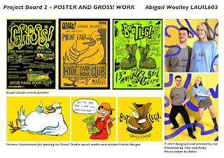
Some of the other work I am really proud of this year are my posters for the Gross! Studio events. These were pieces of work created with an audience in mind, and I think they effectively communicate the laid-back, fun atmosphere we hope that our events have. This was another opportunity to used character-based work, and I think it worked well here.

I think the aspect of this module that I struggled with most this year was time management. Since me and Katie began our studio, we’ve been allocating a lot of time to that which made it difficult to focus on 603 as much as I would like to. I also ended up working at my job outside of university a lot more towards the end of this year (four days a week instead of two days a week), which again took some of my focus away from university. This is a job that I want to continue after graduation so I can afford to stay in Leeds, so I feel like it’s a compromise I had to make. Despite this, I think I have put together a relatively strong portfolio that will help me after graduation, and the time allocated to Gross will be very beneficial after university even though the time spent on it may end up affecting my grade for this module.

I think the main thing I have gained from this module is a new level of confidence in my work, and a wider breadth of skills. Making the posters etc. for the Gross exhibitions/print fairs has shown me that I am confident enough in my work to use it to market an event, and put it in the public’s eye. I have also become a lot more accustomed to video work this year which is an important skill that I am sure will be beneficial in the future. In addition, I now have a much better understanding of curating and project management from co-running all the events with Katie.

I would have liked to spend more time in the print room this year as linoprinting and screenprinting are both methods of image-making that I really enjoy, and I think linoprint especially lends itself well to the tone of voice of my work. However, these are resources that I probably won’t have access to as easily after graduation, so I think it was best that I spent more time developing methods of working that I will be able to continue easily after graduation without as many resources. The method I developed over this year is the ink drawings, and then bitmap textures. It’s a way of working that I really enjoy and I think it helps give my work a consistent feel to it, and it’s also straightforward and I will easily be able to continue doing this after I leave university.

I am pleased to be finishing this module with not only a portfolio I am proud of, but also some long-term projects underway that I can continue to work on after graduation and into my professional career.

Project Boards


Sunday, May 5, 2019

Reflection 4


This is my final 7x7 image. It’s a poster for our upcoming Gross! Studio event. Me and Katie worked on the putting this poster together, but most of the illustration is my own. I’m really pleased with how this illustration came out, and I think the tone of voice is exactly what I had hoped for. The exhibition theme this time is ‘bootleg’, so any work that is a knock-off, DIY version or parody of something else. For this reason, I wanted the poster to have the feel of an old 70s style punk poster, which tend to look very bootleg and low-fi. I think we managed to achieve this, and I think this style works well for appealing to an audience that would be interested in coming to the exhibition.

This approach to putting together images (ink, then scanning and adding bitmap textures) is something that I’ve been developing over this year and I am really enjoying it. It gives my work a consistent feel to it, and it allows me to produce effective images relatively quickly. It can also be very easily transferred to screenprint as well if I would like it to. I think I will probably continue with this method of image-making after graduation.

Aside from this poster, I have been mostly trying to work on finishing off projects and creating work for the upcoming Gross! exhibition. However, a few of the recent projects I’ve been working on have been collaborative with people on other courses so it’s been difficult to find much time to properly get on with them since everyone is working to different deadlines. This is something I know I will have to deal with when working collaboratively in the future so this has been a good learning experience. While I know I won’t get them all done for the hand in, a lot of the work is underway and will at least be finished for the Gross exhibition and for the end of year show.

The collaborative work I have underway is an animation that I am making with my sister, a bootleg “infomercial” with my housemates who is on creative advertising, and a comic with another of my housemates on creative advertising. I should be able to get the animation done soon since I just have to add sound. The infomercial will also be done within the next week or so in time for the bootleg exhibition. The comic on the other hand will be a much more long-term project I think, possibly lasting a few months/years. I’m going to try not to rush it and instead I will focus on creating the tone of voice I want for it and fleshing out the story.

4th 7x7


Thursday, March 14, 2019

Reflection 3


 I have begun to try and get stuck into slightly longer projects. My most recent 7x7 is probably one of my favourite pieces of work that I’ve made. I am trying to work with more restrictive colour schemes in order to make the work more easily transferable to screenprint, risograph etc.

This recent project is a personal passion project that I’ve had in the back of my mind for years. About 5 years ago I wrote a short story, and feel like extended practice is a good time for me to try and illustrate it. The 7x7 is part of the front page illustration for my publication. The story itself is about 900 words long, and I have tried to illustrate some of the main points within the story. This is yet more character-based work, but I think that the illustrations within this publication are some of my strongest work. I’m really pleased with the sense of humour and tone of voice that comes across within this project, it’s exactly the sort of feel that I would like my work to have.

I’m also really enjoying the new process I have been using to create work recently – using pen and ink and then a limited colour scheme and bitmap textures. I find that this work looks quite bold and eye-catching, and it’s quite quick to create making it a very practical process to use.

For a few years, I have also really wanted to risograph my own publication, and this feels like the perfect project for it. It’s a short publication, and the limited colour scheme lends itself to a printing process like risograph. However, I have found it incredibly difficult to balance the illustration style with the graphic design side of the publication, like the font and layout. I have experimented with a few different ways of presenting it all together, but if I am going to commit to printing out quite a few of these publications I want it to look as good as I possibly can. I think I will need to get the opinion of someone from graphic design.

Aside from this publication project, I have just been doing a couple of other smaller projects. I did a poster design for an upcoming print fair that me and Katie are hosting, and I also printed some t-shirts using a similar design. I used the same character for both, and this has been a fun exercise in branding. I think it was quite effective, as it was instantly recognizable as being part of the same event.

I also did a New Statesman editorial for the article about Beck. For this I chose to experiment a bit with monoprint and monotype, because I had never properly explored this before. I also wanted to use this as an opportunity to try something that wasn’t character based. I’m actually really pleased with the result, but I also printed the designs as t-shirts and I think this was probably a more appropriate outcome. I imagine for the editorial they would probably have preferred something character-based, or more literal.

3rd 7x7


Reflection 2


Since my last reflection, I have predominately been focused on the COP deadline so there hasn’t been a huge amount of progress with my extended practice work. This was to be expected though and now I can focus most of my time on this module. I have done a couple more smaller projects plus some idea planning for a few more to begin soon. The first project was for an exhibition at North Bar, and this is my 2nd 7x7. The exhibition was up during the superbowl, and the brief was to create a beer label inspired by a football team. I got given the Denver Broncos. This was another fun project because again, it was on a subject I didn’t know anything about. I did some research into the football team and also on the Denver area. I tried a few things out but in the end, I decided to take the most inspiration from the Denver Broncos logo. Since my character-based work is generally the most successful, I chose to go down that route for this brief. I reimagined the white horse logo as a more playful character, and used the colour scheme of the logo as well for the rest of the design. Overall I’m quite pleased with the outcome of this project, I’m not sure what else I could have done that would have worked better with my personal way of working. I also really enjoyed this project because I just worked on it solidly for a couple of days, and this showed me that I could probably work quite well in this way post-graduation – maybe for editorial or other projects with a quick turnaround time.

I have also recently made a video. I wanted to learn how to use premiere pro, so I took footage from a recent snowboarding holiday with my family and tried to recreate a sort of 90s style, funny snowboarding video. I had a huge amount of fun with the project, and I think it was exciting to use a different medium to explore narrative. It was a steep learning curve since I had never used the program before, but I’m really pleased with the outcome and it is pretty much exactly what I was going for. While this isn’t necessarily illustration, I think being able to use premiere pro could be a valuable skill for the future. Me and Katie Day are beginning to establish our studio a little more, and if we put more events on in the future it’ll be really good to be able to create videos after the event to help promote more things in the future.

2nd 7x7


Reflection 1


So far this module I have been mostly focusing on smaller projects and just having a lot of fun with them. I’ve been producing a lot of work for the upcoming exhibition, such as the paintings I’ve been doing and some linoprints etc. I’ve also done a large scale interactive painting, which people put their head in.

I have mostly just been experimenting with a variety of different processes and approaches to smaller projects so far. For example I’ve been doing some painting, some short comics (based on Wallace and gromit), some 3D work, and some work for other exhibitions.

I have been enjoying these projects because they’ve been quite short projects but there hasn’t been too much time pressure, which has given me the opportunity to experiment with some different approaches. For example, my first 7x7 for this module is for my So Young Magazine submission. The brief was quite loose, we were just given a list of artists and bands and you could create a piece of work inspired by them or their music, or a line from a song etc. I chose Mark E. Smith because I didn’t know much about him so it gave me the opportunity to do some research into his music and what he was like as a person. This was a lot of fun, and I ended up combining linoprint with some analogue and digital techniques to create the final product. I’m really pleased with the outcome because it’s not a way I usually work but I think it’s very effective for the subject matter.

The Wallace and Gromit ‘parody’ work that I’ve been doing has also been a lot of fun – it has allowed me to explore the dark but humourous tone of voice that I have been hoping to achieve, and has also allowed me to focus some work on characters and on narrative. This is something I’d like to explore further through the module, however I don’t know how far I could take this project. It would be a lot of fun to do a lot of short one-page comics and then possibly collate this into a publication or something along those lines, but on the other hand I would prefer to focus my time on creating my own characters and maybe some longer stories. I will have to see how this progresses.