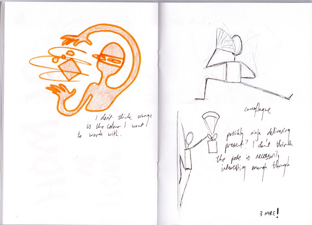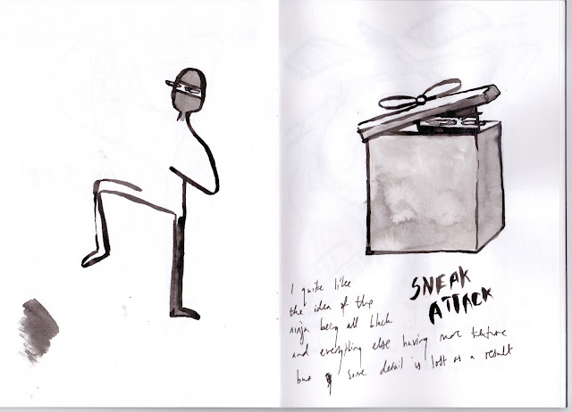
This was my first draft of the poster. I was happy with the way I drew the ninjas, as I think the elongated arms and shifty facial expressions add some humour to the piece. However, i felt that the grid layout was a bit uninspiring so I experimenting with different layouts after I had figured out some of the ninja moves.


After I had figured out all the different moves I wanted to use in the poster, I started to experiment more with media and colours.


I eventually settled on black ink on pink paper because this colour combination makes the ninjas stand out quite well, and I really liked the slightly uneven effect of using ink. I also considered using charcoal to imply movement, but came to the conclusion that this might make the poster look a bit too messy and overcrowded. After this, I played around with the composition of the poster a bit more.

In the first image, I scanned in all my rough sketches and changed the position, but I found this too difficult to do so instead I photocopied all the sketches and laid them out on the sheet of paper i was going to use to get a sense of how all the ninjas fit together, and this worked much better.

This is the finished poster. I'm quite happy with how it turned out, I think the font I used for the title matches the illustrations well. I think if I were to do this again, I would make all the ninjas fit together a lot more and elongate their limbs further to make it more comical. I would also name all the moves and write them around the outside of each character in the same font as the title.

No comments:
Post a Comment